Logo and website for Nazca design
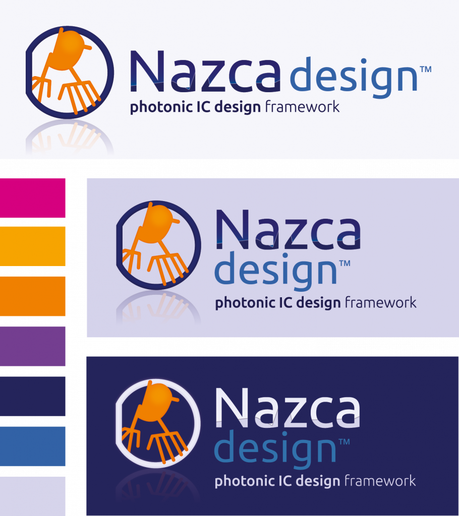
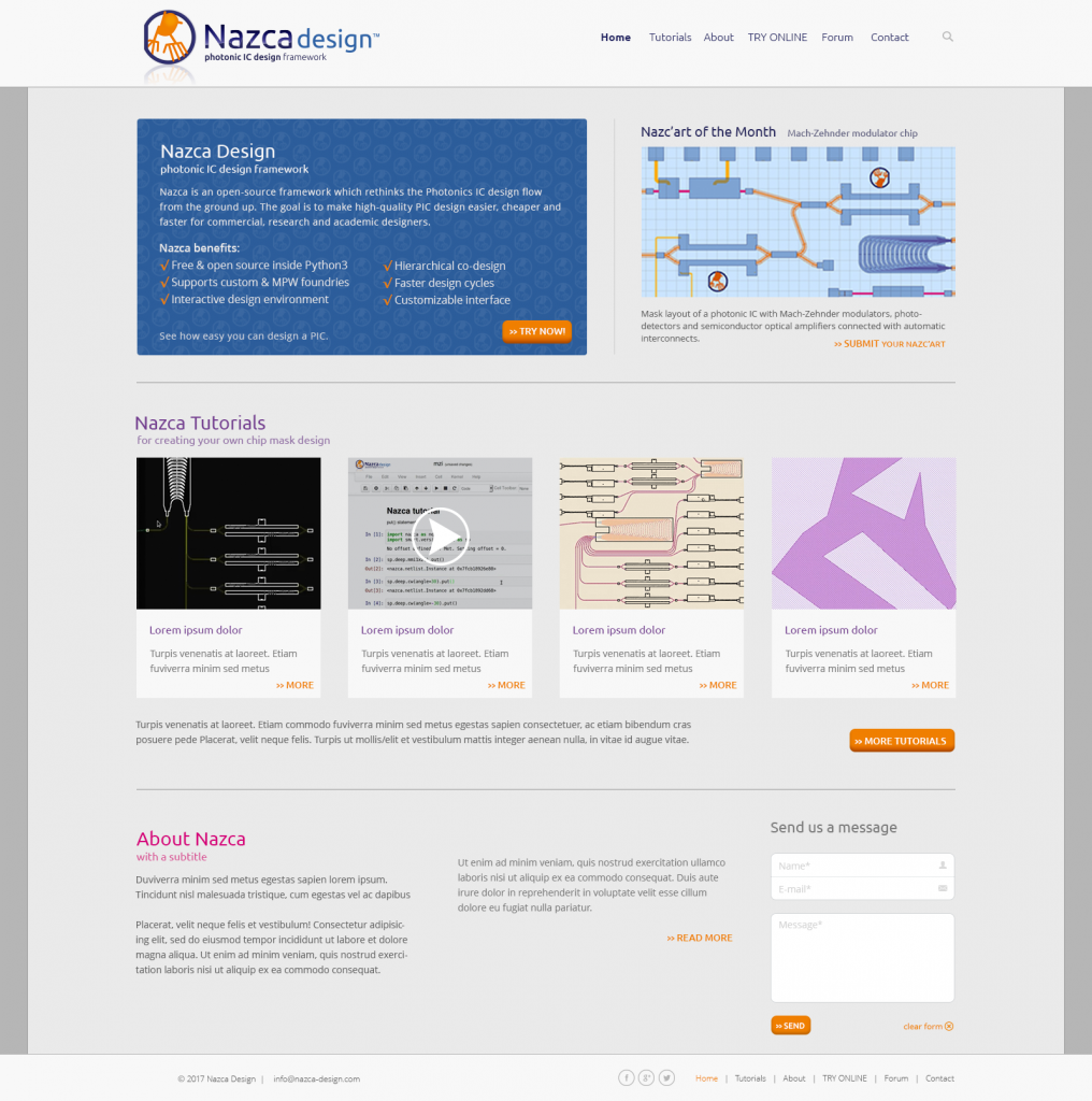
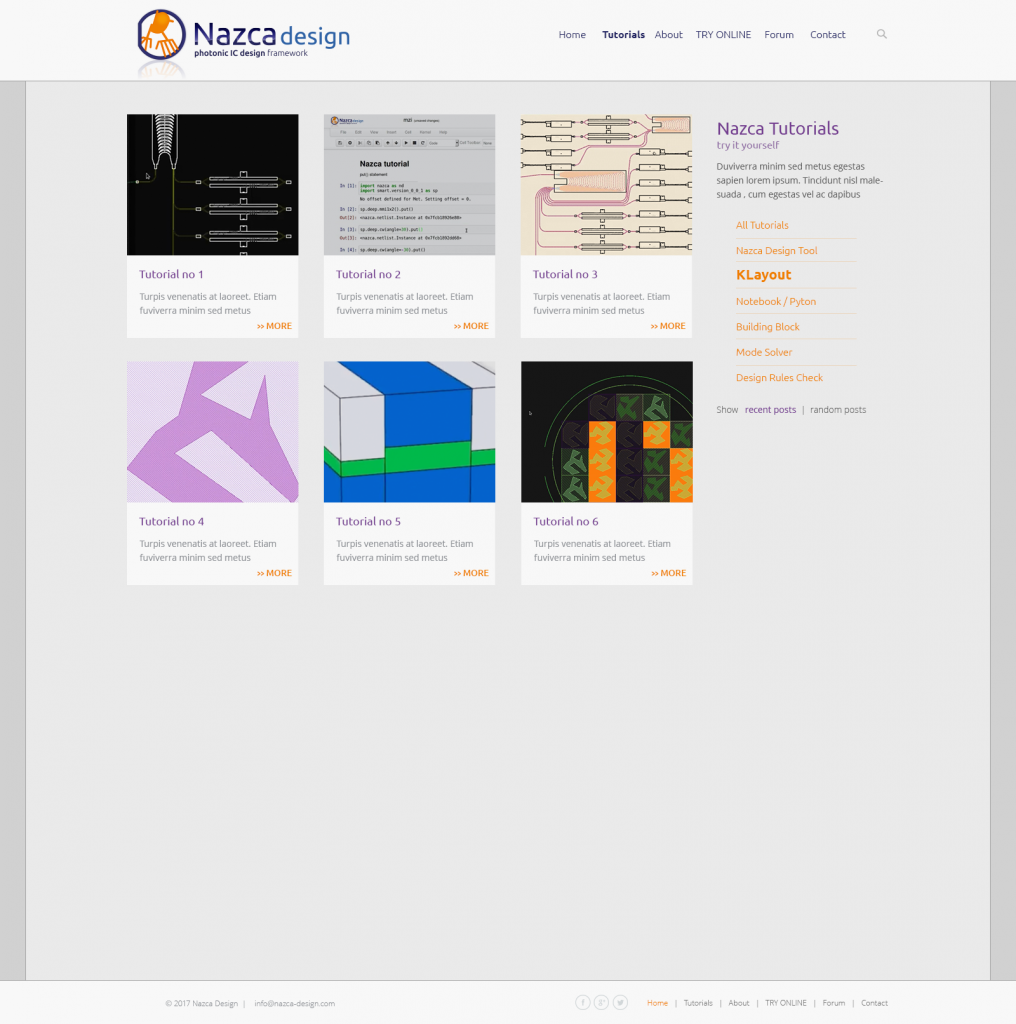
Commissioned by Bright Photonics, the Nazca design logo was designed, a color scheme was made and matching fonts were selected. Also, in collaboration with the Digibastards a website has been developed, which has been set up so that the customer can maintain it himself.
Inspired by ancient shapes
As a starting point for the logo one of the well-known ‘Nazca lines’, on which the name of the design program is based, was used. We chose to use ‘the Hands’; a clear and simple image, and matching the ‘hands-on mentality’ of the creators of Nazca design.
The colors, shapes and fonts for Nazca design are designed to fit in with the corporate identity of Bright Photonics. This way the connection is immediately visible and the two can be combined well. The Bright Photonics logo is currently being restyled, so that the logos fit even better together.
About Nazca design
Nazca design is an open-source design program for Photonic ICs, developed by Bright Photonics. The aim of the program is to make designing PICs faster, easier and cheaper.
More information about Nazca and Bright Photonics: https://nazca-design.org/


