Pedicure practice Kasius

Corporate Identity and Promotional items
for Kasius pedicure practice

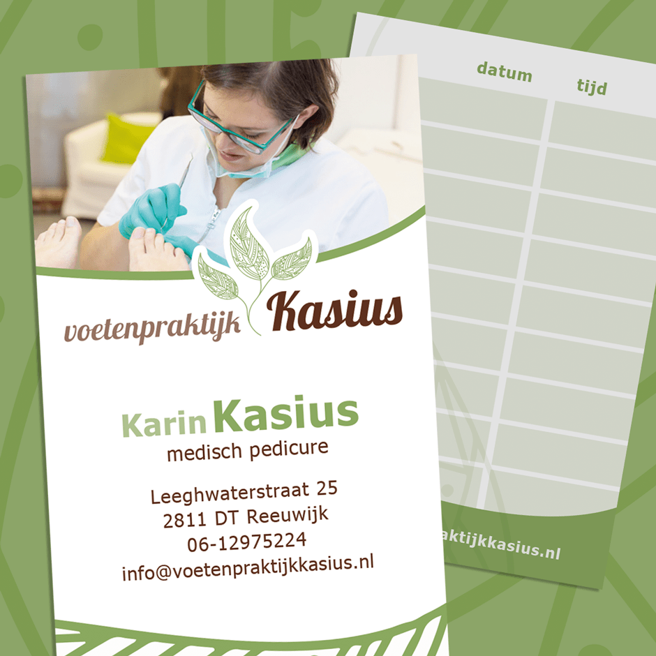
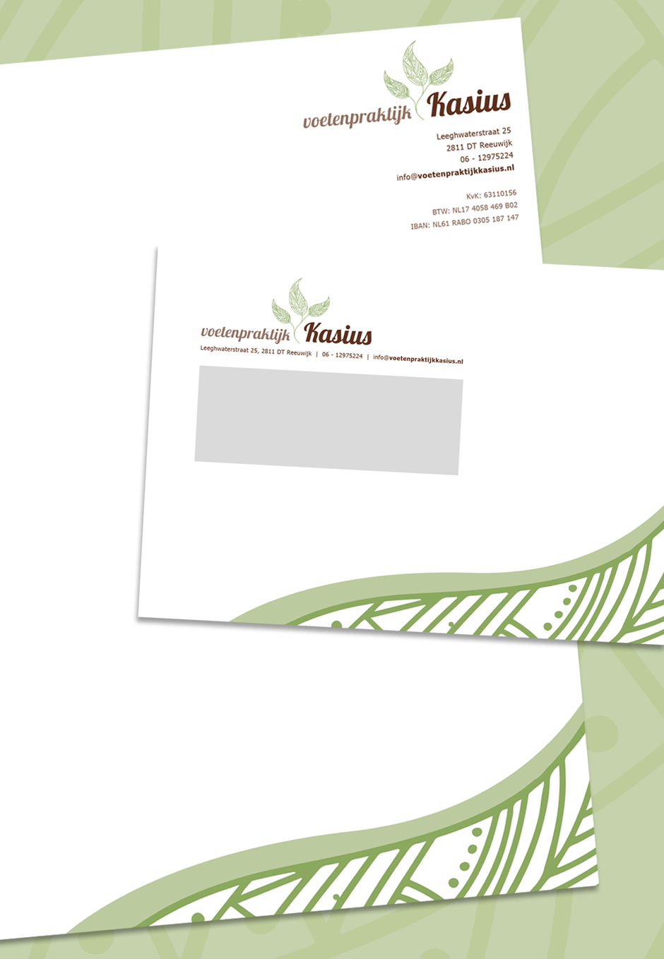
Kasius initially came up with the request for a business card design. To make a fresh start,  first the logo was slightly restyled with a more modern font. To create an unambiguous appearance, several ads, corporate paper and envelopes have also been designed.

Pattern of lines in fresh green

A fragment from the logo is repeated in all designs. By using only a part, an interesting and abstract line pattern is created. The fresh green color represents the use of organic care products.
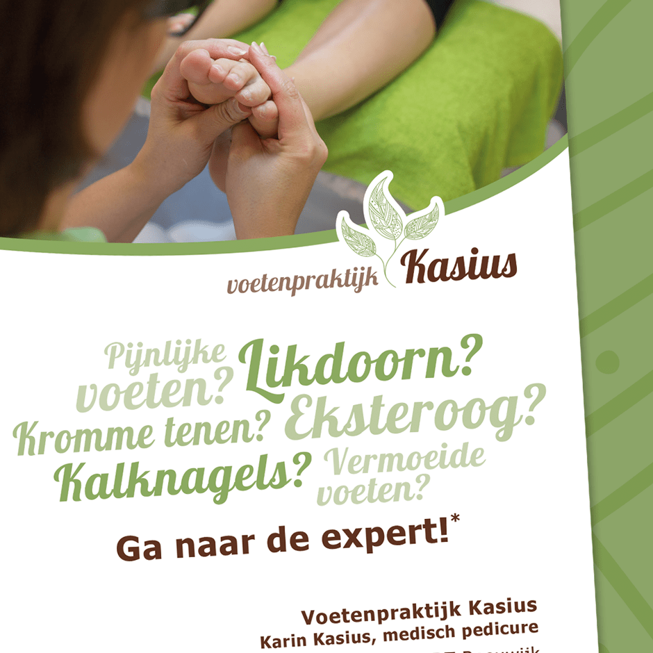
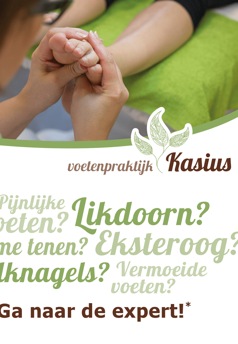
About Kasius

Pedicure practice Kasius offers various foot treatments with organic care products. As a medical pedicure, Karin Kasius remedies discomforts and treated feet in a relaxing atmosphere.

For more information or to make an appointment, visit: voetenpraktijkkasius.nl

2 in 1 business- and appointment card

The business card features a photo of Karin Kasius, owner of the practice, which ensures that the name is better remembered. On the back there is room for a note of (follow-up) appointments, which makes it a stylish and practical card.

Corporate paper with matching envelopes

A part of the logo has also been used on the corporate paper and the envelopes. By keeping the designs very simple, they are practical to use, and by repeating the line pattern a uniform appearance is created.

Advertising with a cloud of words

For the design of an advertisement, the same layout as the business card was used. By adding a cloud of words, in different sizes and colors, it is clear at one glance what pedicure practice Kasius offers and it gives the ad a striking look. By keeping a good balance between dark brown and fresh green, the design gets a fresh look with good contrasts.

This is a unique website which will require a more modern browser to work!

Please upgrade today!