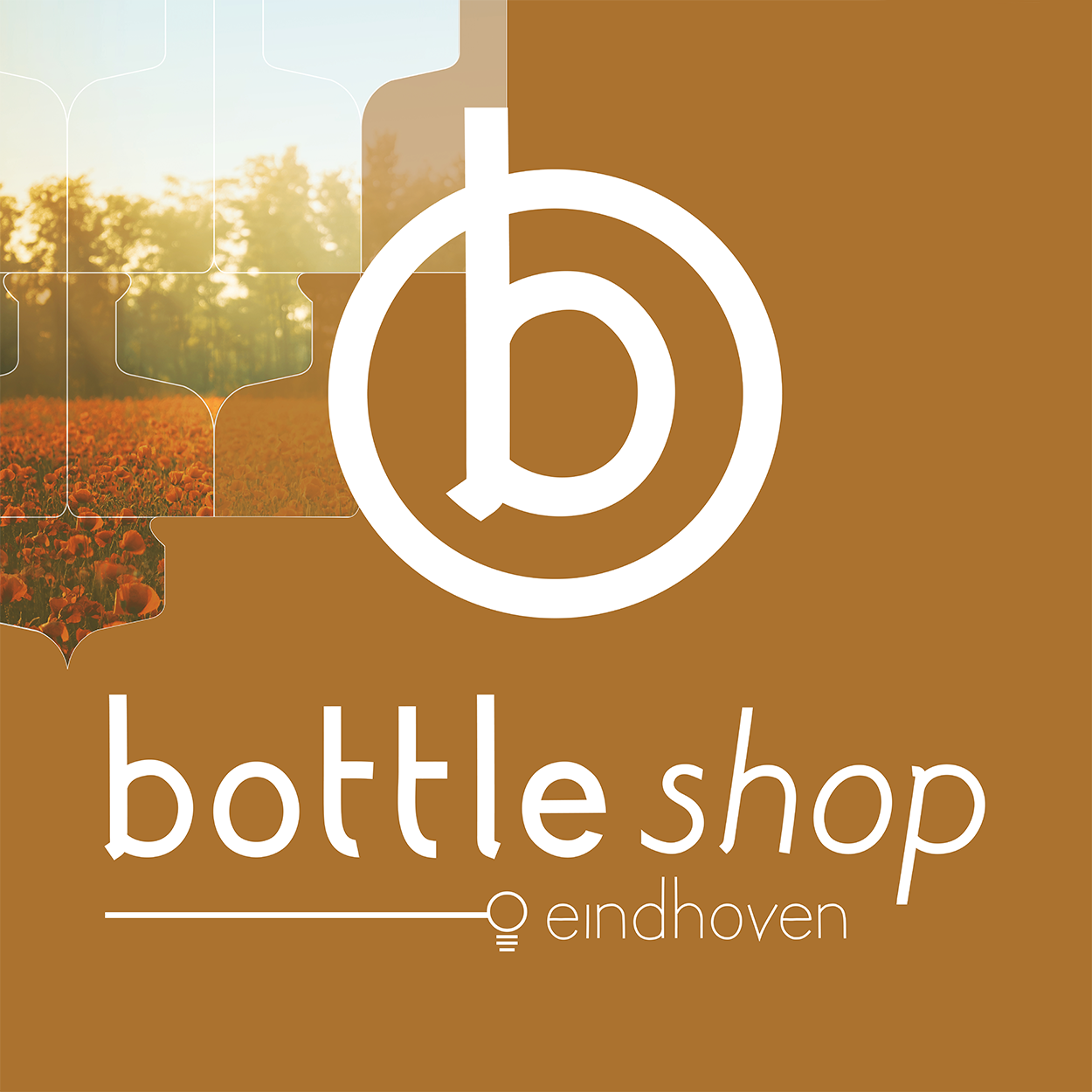
Renewed identity for Bottleshop
The corporate identity of Bottleshop has been completely renewed. Matching a very varied target group, a minimalistic design was created in neutral, warm colors and with lots of whitespace.
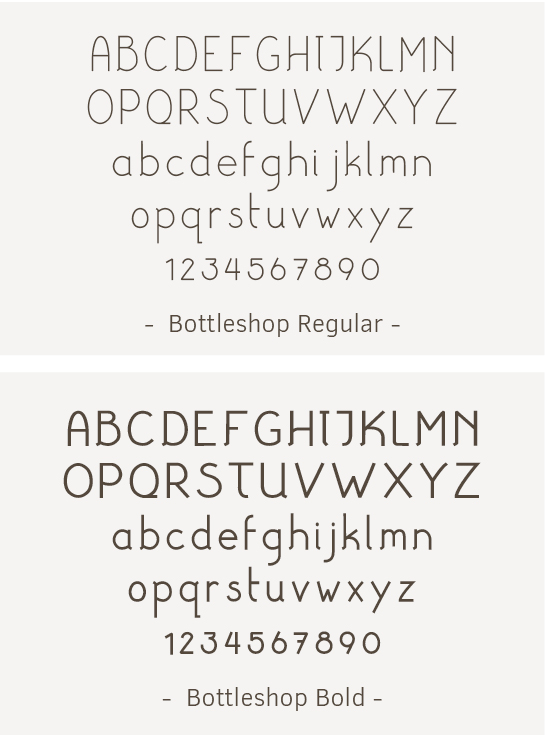
Design of logo and font
A minimalistic trademark and a typographic logo were developed, together with a custom made font for Bottleshop. The font was specifically designed to make sure it fits seamlessly with the refined lines and shapes of the new identity.
With the logo and font a foundation is laid for the whole new identity.
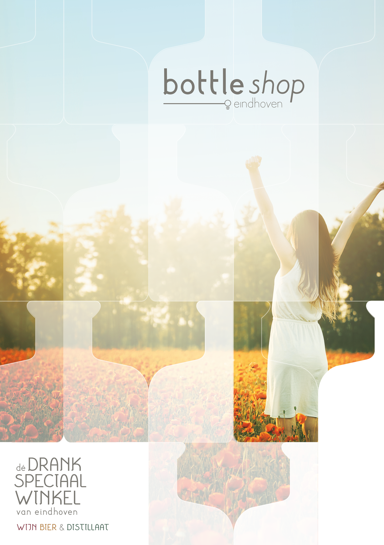
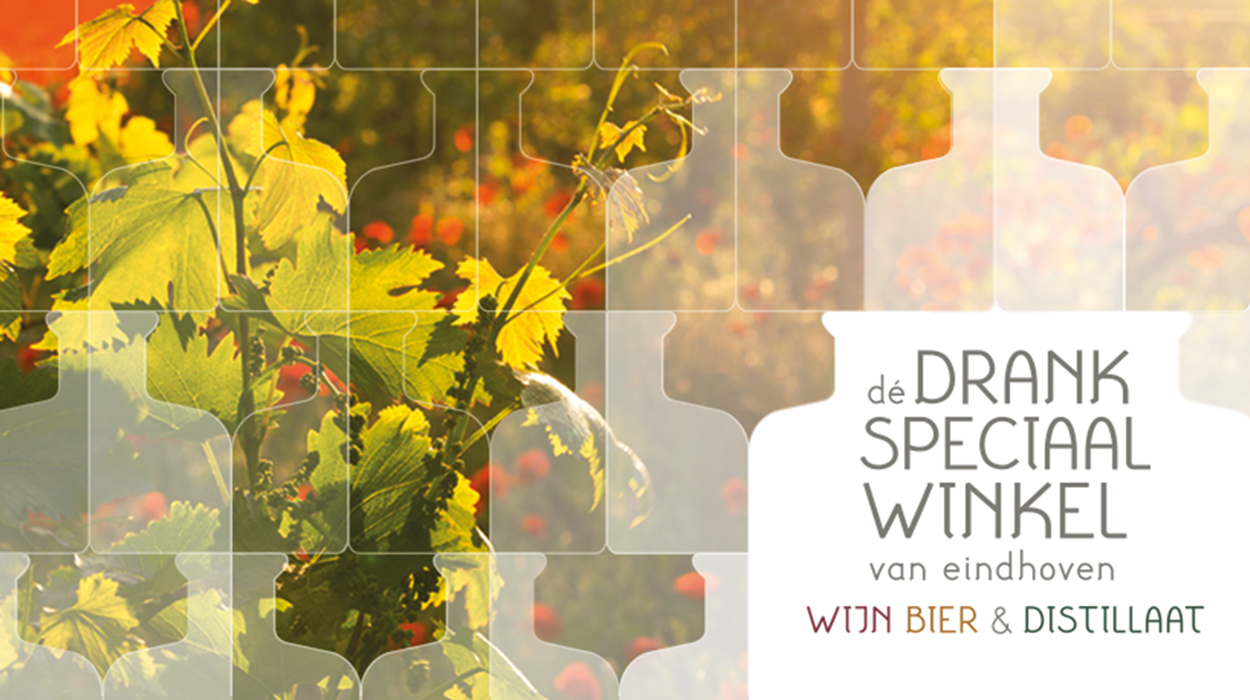
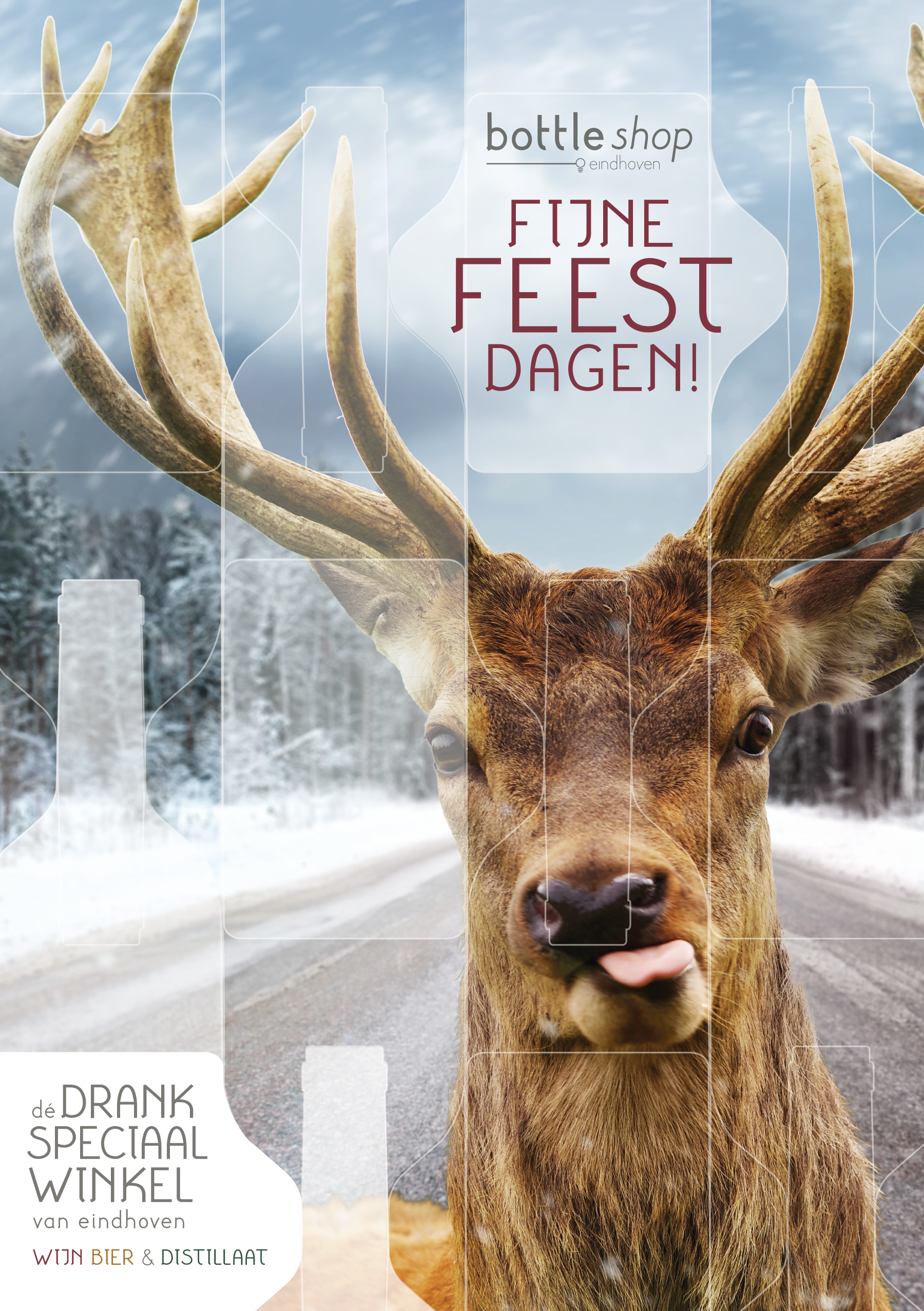
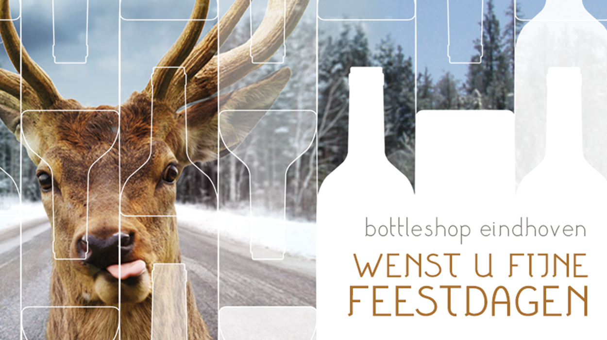
Image recognition by patterns
In order to create recognisability, we opted for the use of patterns, designed especially for Bottleshop and developed from repeating line drawings of liquor bottles. The patterns are very versatile and therefore used in very diverse media expressions.
Fancy a drink? Take a look at the website or pay a visit to the store in Eindhoven or Den Bosch
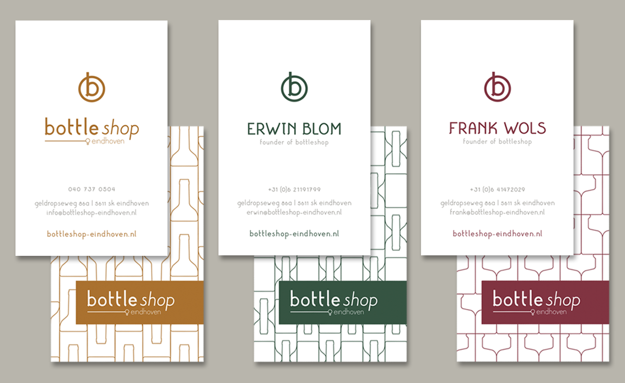
Business cards in the corporate colors
Three variants have been designed for the business cards, one for use in the store and one for both founders. In the the business card designs the three corporate colors and three pf the patterns were used.
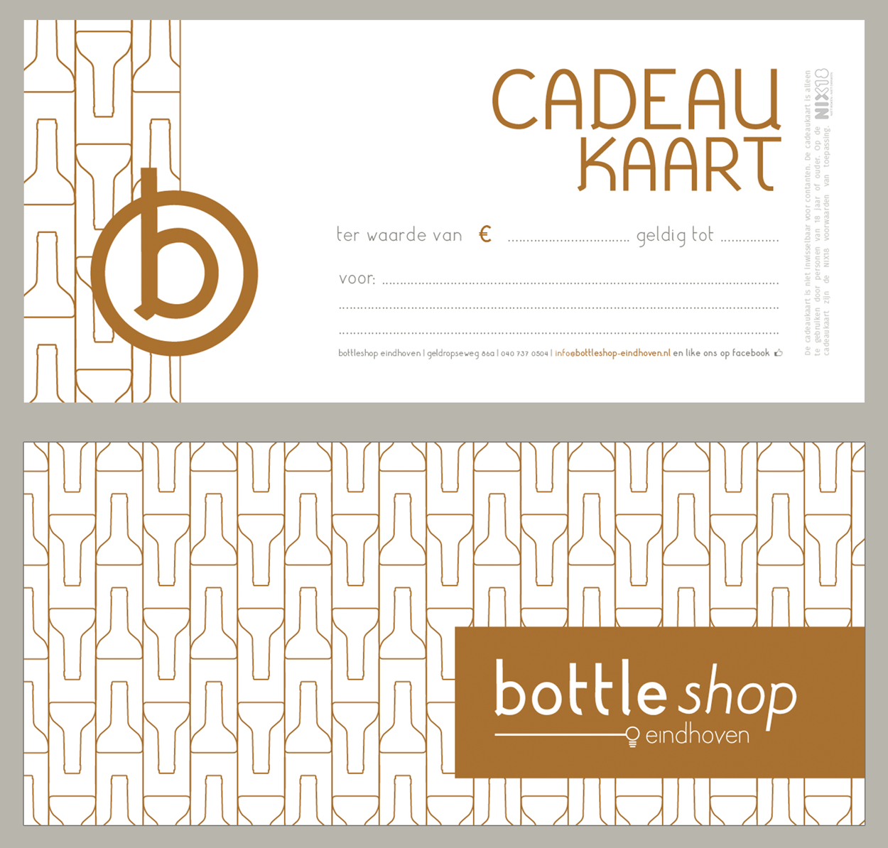
Stylish gift
Of course, a gift voucher is an indispensable product for a store. A minimalistic design has been made for the gift card, with one of the patterns on the back for recognisability.
Template for poster and facebook banner
For special occasions or promotional purposes a poster and facebook banner have been designed. The first designs were made by Smit Grafische Vormgeving and delivered as a template. The Bottleshop can thus get started with designs in its own corporate identity.