![]()
Corporate Identity Beleefweek Limburg
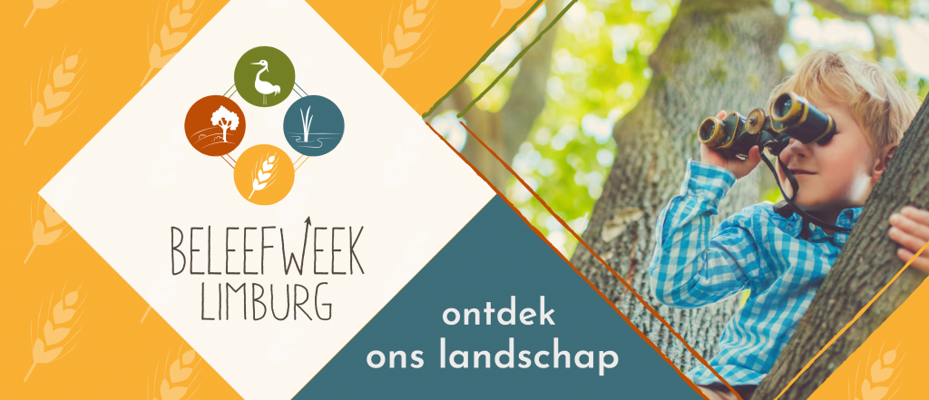
For Beleefweek Limburg (Experience Week Limburg) the complete corporate identity has been renewed, in collaboration with Strijpkracht. The style has been given a subtle, playful look in fresh colors inspired by the late summer feeling.
Narrative logo
A word mark in a subtle font and a playful logo were designed. An individual icon for each nature reserve has been developed, tailored to its own characteristics. By connecting the icons in a subtle way, the connection (Province of Limburg) has been made clear.
Colors, shapes and patterns
The fresh colors, sleek shapes and friendly patterns give the corporate identity a cheerful appearance. The combination with sunny photography makes it perfectly in line with the key words: taste, discover, experience and marvel.
About Beleefweek Limburg
Beleefweek Limburg introduces people to the beautiful landscape of the Dutch province Limburg. In Limburg you will also find many highlights in the field of nature, culture, history and regional products.
More information: www.beleefweeklimburg.nl
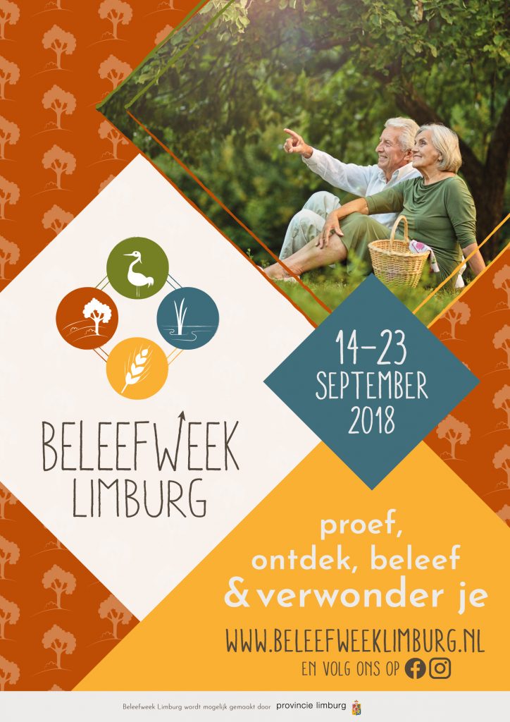
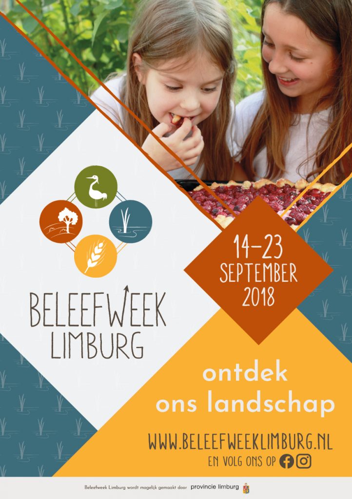
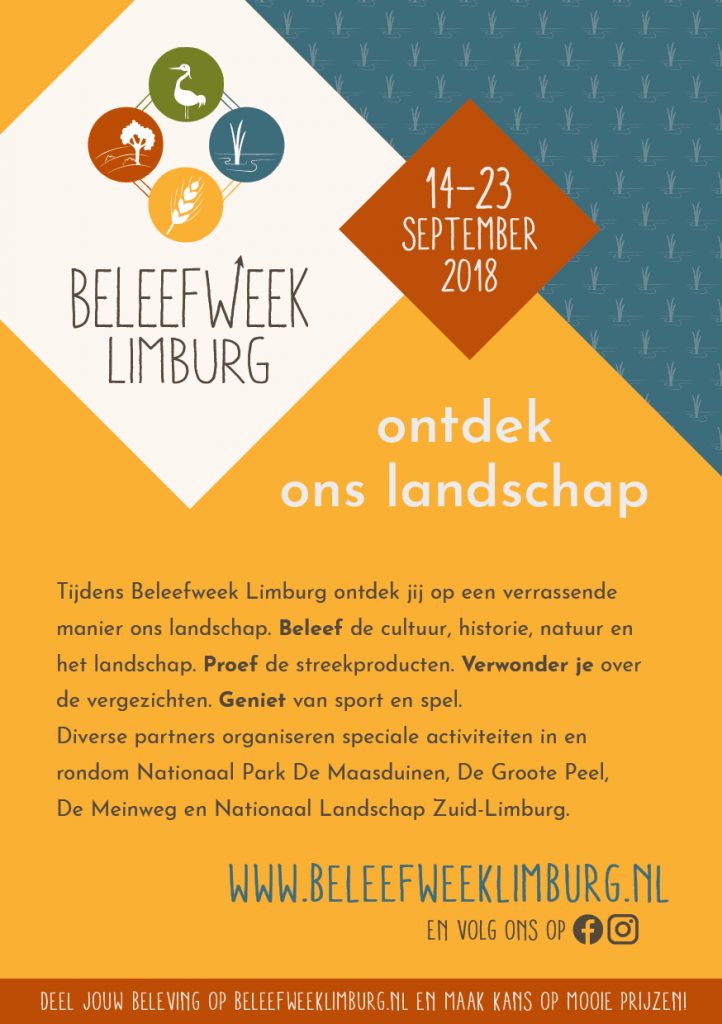
In addition to the logo design and the determination of colors, shapes and typography, various promotional items were developed. For example, different variants of a poster were designed, with a matching flyer and Facebook cover photo.