![]()
Corporate Identity with manual for JePPIX
The JePPIX logo has been restyled and four logos have been created for the various business components. In order to be able to use an unambiguous appearance a corporate identity is determined and described in a visual identity manual.
Recognizable and practical logo
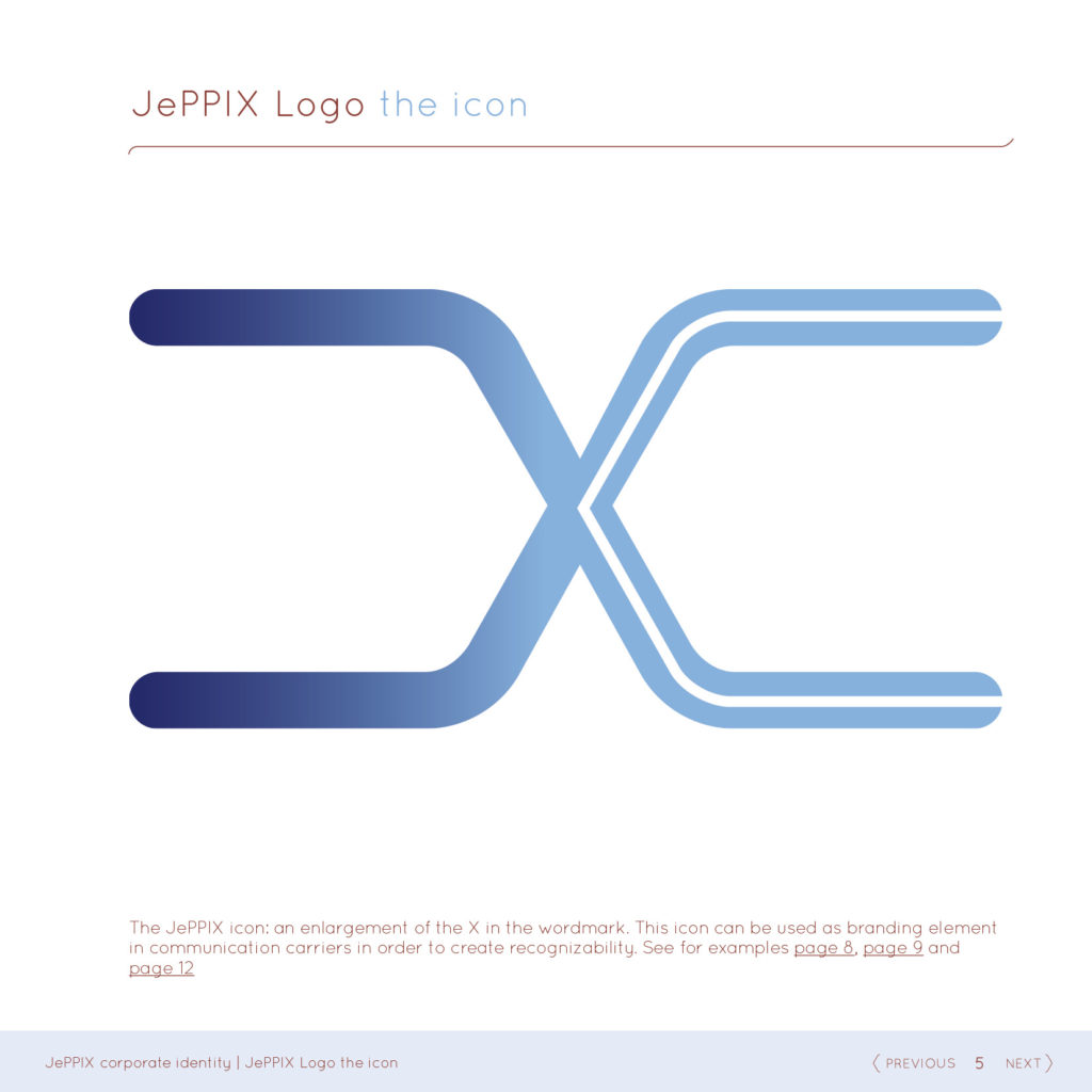
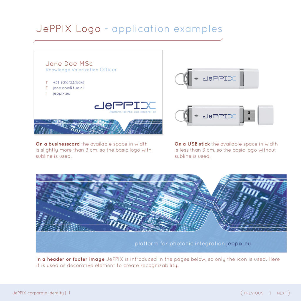
To make it a less elongated logo but to retain its recognisability, the same font was used but with in height-adjusted letters. Because JePPIX usually is written with an ‘e’ in lowercase, this also is implemented in the logo. We have changed the subtitle to a shorter line, so it is better readable when the logo is reduced in size. With a visual brandmark (the “x”) integrated in the wordmark, it gets its own character and makes it very practical to use.
Multiple logos, one style
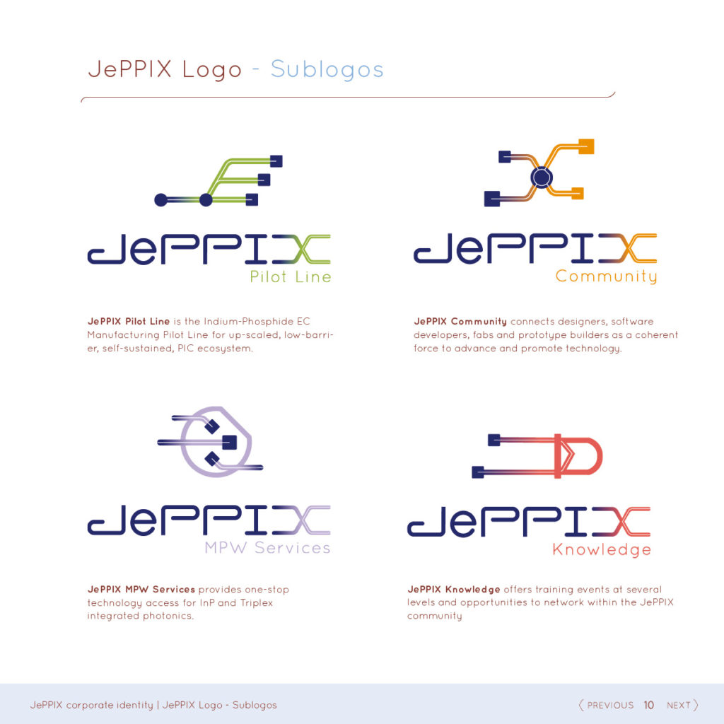
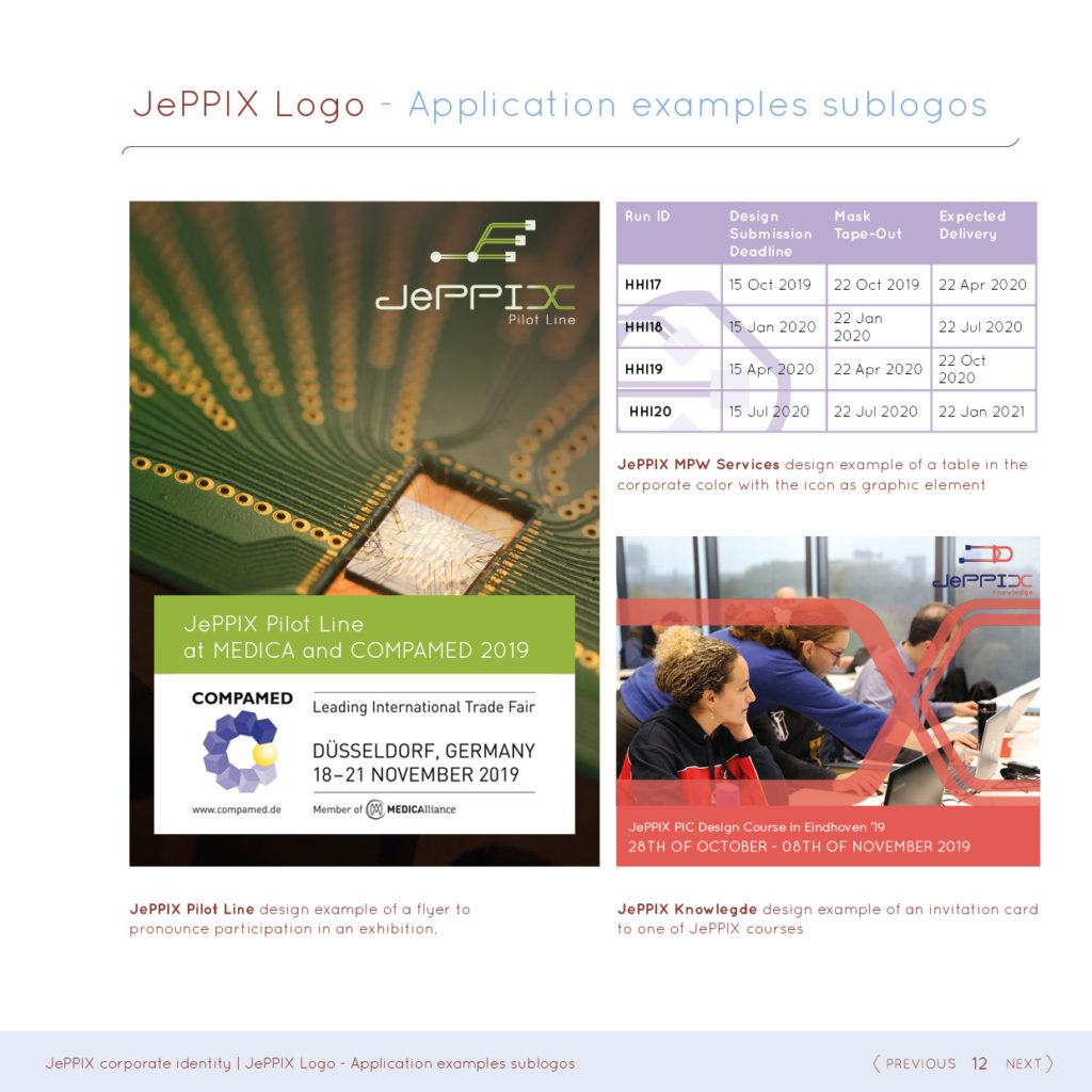
In addition, 4 sublogos have been designed: Pilot Line, MPW Service, Ecosystem Development and Training. The visual marks make a clear distinction between the various business components and give an abstract representation of those components, in particular intended to create recognisability. The simplicity of the icons makes sure that they will last when used at small sizes.
About JePPIX
JePPIX (short for Joint European Platform for Photonic Integration in Components and Circuits) is a consortium of European industrial and academic key players in InP-based photonic integration technology. More information can be found on the website: jeppix.eu