![]()
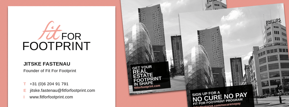
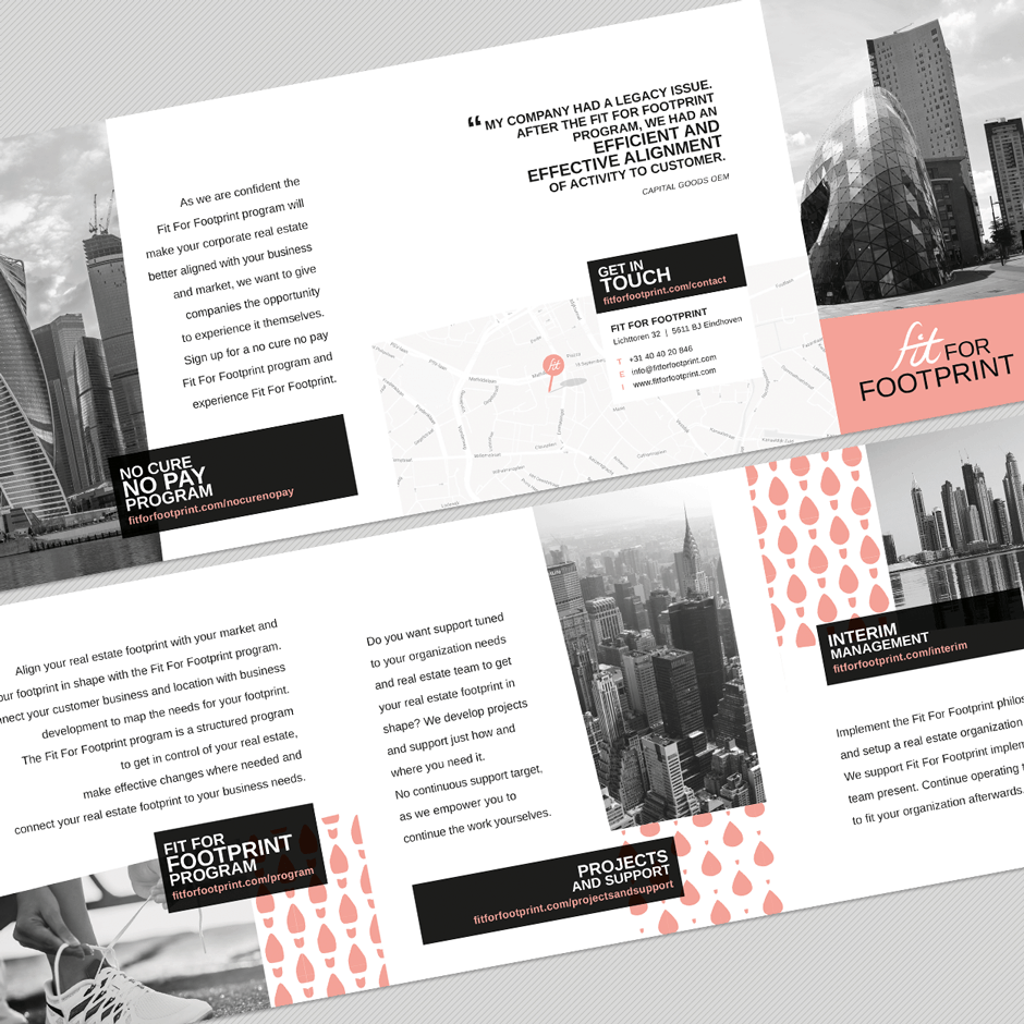
Design of logo, business card and flyer for Fit for FootprintL
Fit for Footprint asked for a sporty logo with a chic, slightly feminine look, to stand out in the (male) real estate world. A challenge; combine two almost contradictions – sporty and chic – to an unambigious style. Based on these criteria, Smit Grafische Vormgeving developed a modern logo with matching corporate identity.
Dark black and soft pink
A lot of black and white, reinforced with a soft pink tint. Black surfaces and white spaces for a sleek, clear design. Photography in grayscale for a classic style. Pink details for a contemporary, feminine twist. An italic letter in the logo for a quick, sporty look. This combination creates a striking image, matching the identity of Fit for Footprint.
About Fit for Footprint
Fit for Footprint is a business property philosophy that focuses on connecting organizations and their real estate, to get a better position in the market and attract more new talents.
More information about Fit for Footprint can be found on the website: fitforfootprint.com