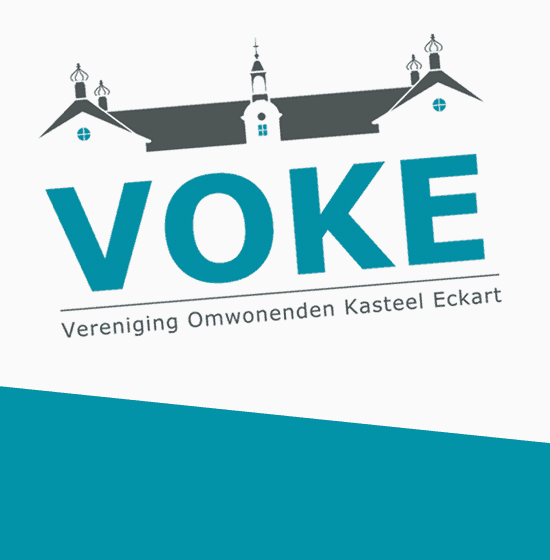
When we met, VOKE had a purely typographic logo. That has changed, because Eckart castle (where VOKE is named after) is a very beautiful and characteristic building. The castle has now been given a beautiful place; as a trademark in the new VOKE logo.
Simple and stylish
The architecture of the castle is simple and stylish. The new corporate identity of VOKE is tailored to this, clean and minimalistic.
About VOKE
VOKE is a community association for residents of the neighborhood near Eckart Castle, that once was the administrative center of the old Glory Eckart. VOKE aims to preserve and strengthen the historic and monumental buildings and nature reserves.
Minimalist and recognizable logo
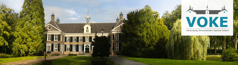
In the design of the logo a minimalist illustration, soft colors and clean typography were chosen. This has given the logo a modern look, recognizable for local residents and practical in use. By combining this with colorful photography, in for example the website, a nice contrast and a warm atmosphere is created.
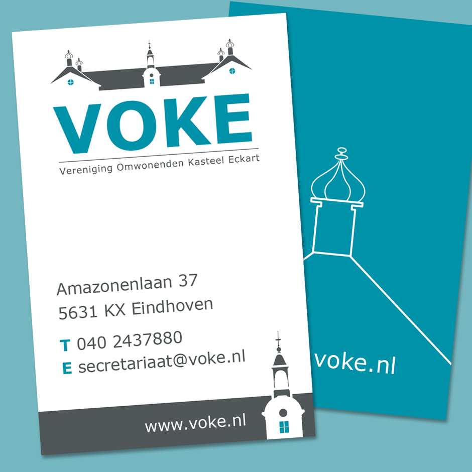
Business card with playful twist
The business card has also been kept very simple. The gray and blue tones make a nice contrast, the illustration of the turret gives a playful twist and ensures recognisability. In addition to the business card, a word template has also been set up to be used as a letterhead and newsletter.
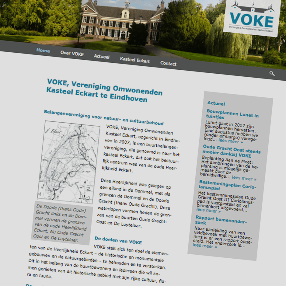
Functional website with appealing photography
The VOKE website has also been given a new look. The gray and blue tones are combined here with a striking photo of the castle. This creates a fresh, modern look. We have opted for a clear structure, so that all information can easily be found.
This is a unique website which will require a more modern browser to work!