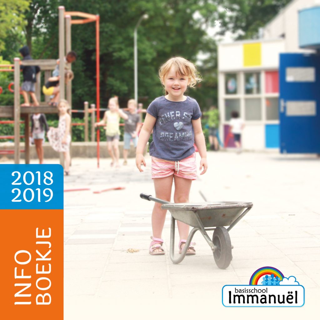
Brochure for Primary school Immanuël
For primary school Immanuel a new design for the information brochure has been made.
The layout has been given a completely new look, new photographs have been taken and illustrations were designed. In addition, we thought about the content of the brochure, to be sure that all information is clearly stated and the text is easy to read.
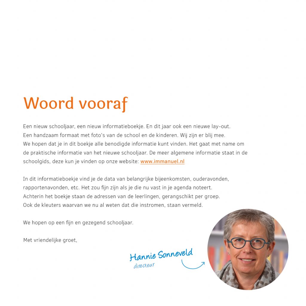
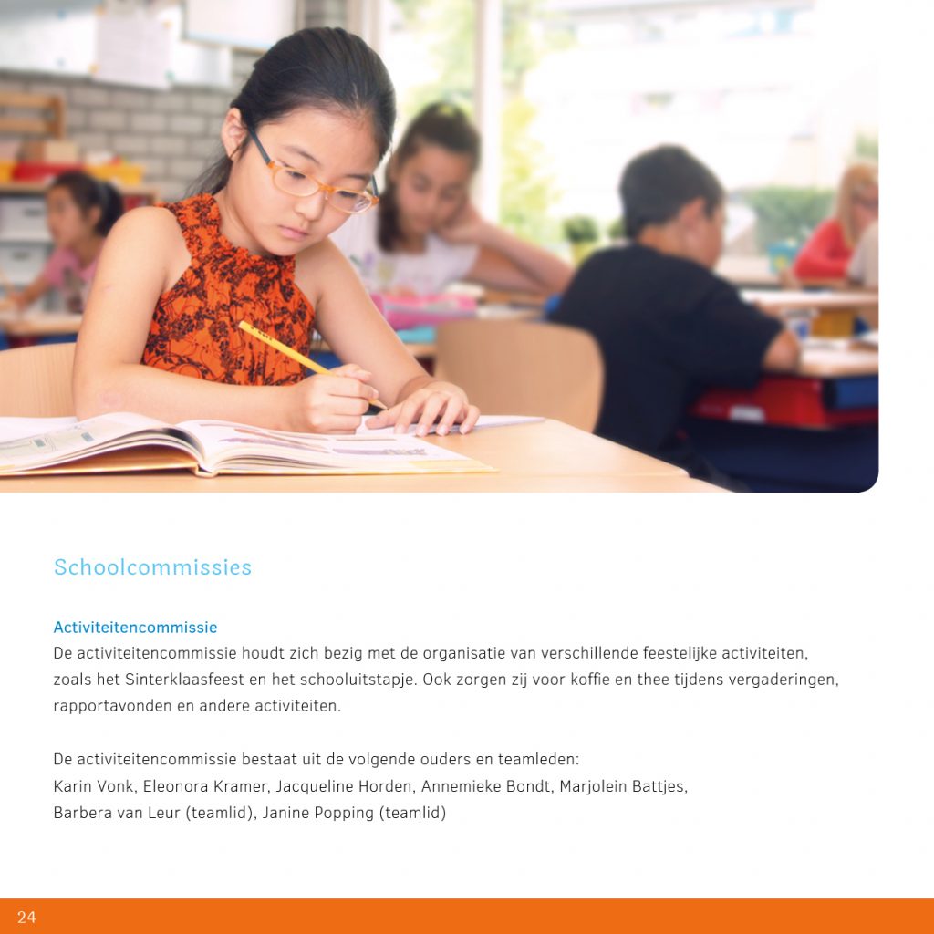
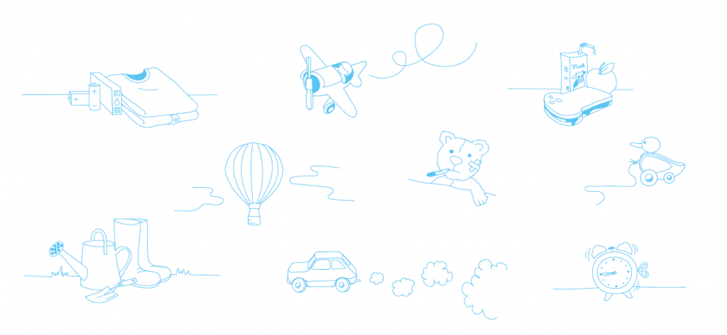
Atmospheric photos and cheerful illustrations
The colorful, sunny images in combination with the cheerful line drawings give the brochure a cozy, warm look that matches the ambiance at school. By playing with light and colors in the photographs, they fit in nicely with the fresh colors of the corporate identity. The subtle illustrations create a playful look.
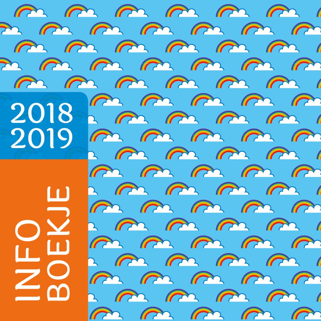
Shapes and patterns
We opted for a square layout and images with rounded corners, which gives the brochure a friendly, playful look. By repeating the rounded corners in colored shapes, a uniform style has been created. The pattern with the rainbow, based on the logo, gives the design the finishing touch.
About Primary school Immanuël
Primary school Immanuel is a small-scale, local Christian school in Best, near Eindhoven. The name means ‘God with us’. This forms the identity of the school and is an important starting point in education.
More information: www.immanuel.nl